Man, February was a short month. It always IS, but it felt extra short to me. I mentioned earlier how much I liked Franziska's Marmalade Skies...so I decided to make March with it. I have been trying to keep areas on both the left and right sides not so cluttered. Hope you like this one. Image clickable and comments welcome:
You're going to WANT this one! Click here to go to the shop:
Welcome...
to my paradise! My blog focuses on all things related to digital scrapbooking. Look for an occasional freebie download as well as scrap/photo related tutorials. Comments are always welcome!
Monday, February 23, 2009
Sunday, February 22, 2009
Pencil sketch tutorial
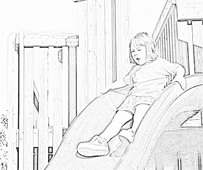
Here is another very simple tut to give the appearance of a pencil drawn sketch. How heavy the shading or how fine the pencil stroke is controlled by you...Let's get started.
Step 1. Open the photo in Photoshop and make a copy of it; in the new layer do this; MENU Image: Adjustments: Desaturate
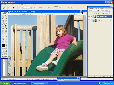
Turn off the original layer..This is result:
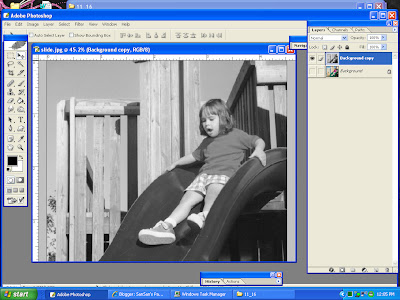
Step 2: Make a copy of THAT layer, so you'll have three. Do this: MENU: Image; Adjustments; Invert
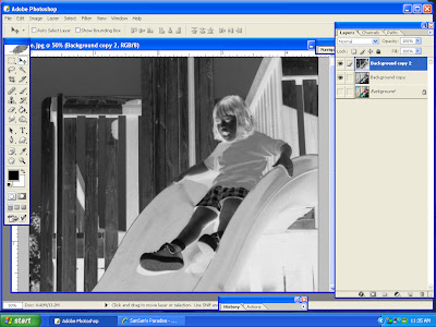
Step 3. On this newest layer, go to blending modes (circled in red below) and choose Color Dodge. Don't worry if the screen is mostly or entirely white. (My screenshot here was all white)
Step 4. Under MENU Filter; Blur, choose Gaussian Blur and move the slider until you get the best result possible.
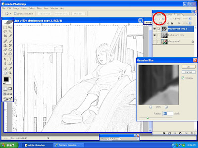
Step 5. FLATTEN image.
You can even take it a step or two further by making adjustments in Levels or Brightness/Contrast. See below:
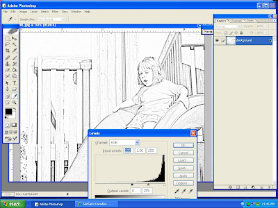
Some tips: If you are doing a head shot, try to clean up the distracting backgrounds first if it will make a better end result. You don't have to do a fully clean extraction because cleaning up pencil blemishes is much easier at the end. This technique is good for low res photos. The example here was made from an extremely poor original. I have a whole group of years that, regrettably, most of my child's photos were taken with a bad camera, so I try to find creative ways to still use them.
Have fun with this easy tutorial!
Step 1. Open the photo in Photoshop and make a copy of it; in the new layer do this; MENU Image: Adjustments: Desaturate
Turn off the original layer..This is result:
Step 2: Make a copy of THAT layer, so you'll have three. Do this: MENU: Image; Adjustments; Invert
Step 3. On this newest layer, go to blending modes (circled in red below) and choose Color Dodge. Don't worry if the screen is mostly or entirely white. (My screenshot here was all white)
Step 4. Under MENU Filter; Blur, choose Gaussian Blur and move the slider until you get the best result possible.
Step 5. FLATTEN image.
You can even take it a step or two further by making adjustments in Levels or Brightness/Contrast. See below:
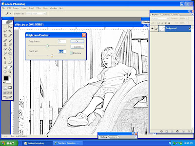
Some tips: If you are doing a head shot, try to clean up the distracting backgrounds first if it will make a better end result. You don't have to do a fully clean extraction because cleaning up pencil blemishes is much easier at the end. This technique is good for low res photos. The example here was made from an extremely poor original. I have a whole group of years that, regrettably, most of my child's photos were taken with a bad camera, so I try to find creative ways to still use them.
Have fun with this easy tutorial!
Wednesday, February 18, 2009
I actually won something!
I never ever win anything, so I tend to not bother entering (which explains the lack of winning- ha ha). But the other day I saw this really sweet little kit by Liella called Buggy Love. I kept going back to look at it, so I was pretty familiar by the time I saw the "Win my kit..." thread at DST. I made my post and forgot about it. I have to tell you- I was so darn tickled when I saw that I had won it. I really wanted to do a layout tonight but I got home really late. I will try to update this post tomorrow with a layout from it, but meanwhile take a look at this...Isn't it adorable!? (Oh, got the Alpha too!) If anyone wants to buy this kit click the image to take you to her store.
Allie, hope you are seeing this...thanks so much!!!!
Sunday, February 15, 2009
Fool that I am...(and two ADORABLE kits)
I should learn that procrastination DOES have it's place. I usually am at the front line for that, but silly me...I started on the "surprise" 13th ADSR challenge on Saturday...and as luck would have it, I was putting on the finishing touches when my partner informed me that they changed plans and now 13 is not necessary. She has a whole house of sick people and if she can, she will complete the other 'half' of the 2 pg spread. Here is what I ended up making. I love the bright colors and this page would not have happened without the challenge, so I won't grouse anymore!
Color me Happy Collab- Jana M Designs and Matahati Designs
Kami at Ziggle Designs has been cranking out some really cute stuff lately. These two most recent kits work very well together. Here is a quick jump to her store where you can find all of her items:
I didn't have to do the individual blades of grass, but I did do the flowers!
Kit:Firefly Lane-Ziggle Designs and Amanda Heimann; detail on flowers from Happy-Ziggle Designs; trail from from Sunny Side Up collab by Pineapple Plantation Designs and Ziggle Designs; Mask: AnnickPhilibert-DoodledFrames4
Kit: Sunny Side Up collab by Pineapple Plantation Designs and Ziggle Designs
Wednesday, February 11, 2009
ADSR wrapping up
Between participating in the silliness currently going on in the Scrap Orchard forums (some of you know EXACTLY what I am talking about), getting my first tutorial off the ground over at Ziggles Peeps CT blog (and here) AND keeping up with the race, I have neglected to post my layouts here from the race. Each example had to be made per specific instructions. Here are just a few of my favorites that I made. All of the layouts are visible in this gallery (as are all the credits per layout in order to keep this post a bit shorter).
This is my absolute favorite. I confess...I spent the most time ever on a layout with this monster. Challenge required showing as many generations as possible in your layout. I recently thought of another photo (too late) that shows three, but I had already had this finished. This tested my use of perspective more than anything. I am proudest of making a flat sheet of paper look like it does here. (Some of these techniques will be future tuts so bookmark me!)
This one was simply asking a question where the answer is obvious in a single photo. The day of this carnival, Nat got on that bull over and over and over again! Photos of her ended up featured in two local papers.
A challenge to scraplift yourself using a layout that was the first uploaded to any of your own galleries. The original (which I still like alot) follows.
Had to scraplift someone else you feel is inspiring. Mine is nowhere nearly as good as the original, but I think I was sick that week...Yeah, that's it...thats my story and I'm sticking with it! (photo of this stunning butterfly always draws me to it because of its gorgeous tiny details.)
No photos allowed, but had to use at least 3 different frames.
Interview your racing partner. When I first saw this kit from Ziska, I yelled WOW! More to come using this baby!
The first challenge and one of my all-time favorite pages. We had to tear photo in at least 3 pieces. I taped mine back together. I like the flow your eye takes in this one.
There is one more challenge left to go and then they draw the grand prize winners. Apparently in past years the winners got mountains of freebies from all over digiland, so I am hoping for a miracle!
Til next time...
Subscribe to:
Posts (Atom)